Hedara Fotya – Brand Re-Design
Tools used
- Adobe Illustrator
- Adobe Photoshop
Role
- Graphic Designer
- Photographer
Year
2026
The client originally had a brand of jewelry named “Hephaestus Fotiá”, inspired by the myth of Hephaestus. They create handmade and original ring designs for weddings and special occasions, but with the twist that the style is heavily inspired by fantasy and Greek mythology, going in a different direction from conventional jewelry. The client felt that his style didn’t fit the black-and-white branding they had been working on so far, so asked me to redesign everything, making special emphasis on wanting something that looks more colorful and interesting.
Design idea
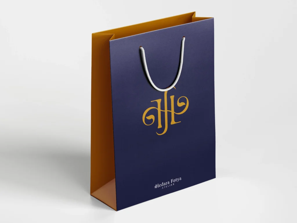
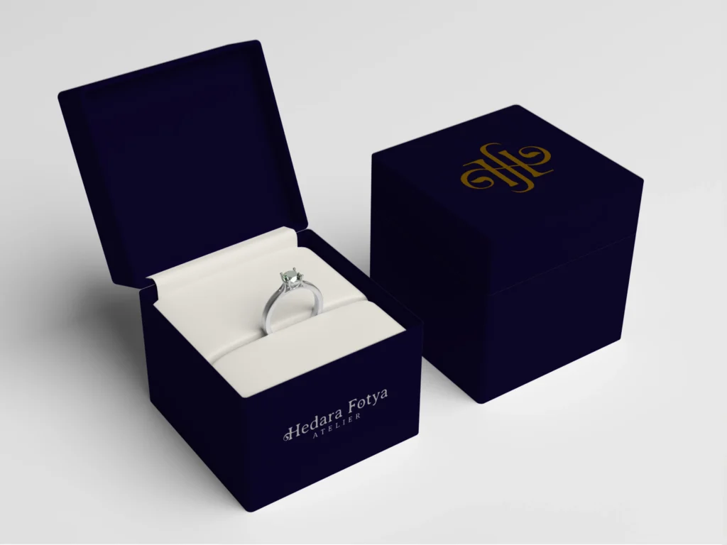
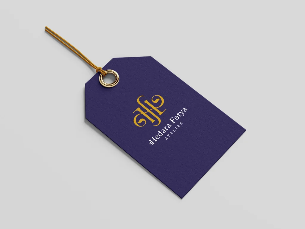
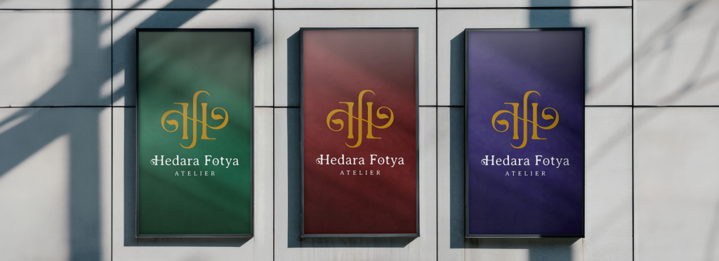
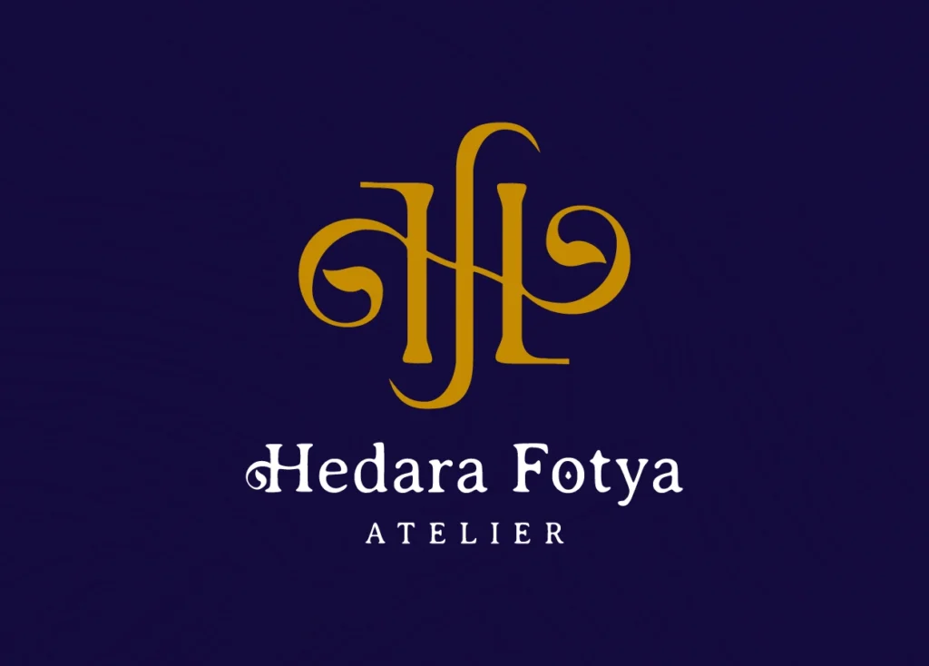
The general idea for this brand is going in a different direction from conventional jewelry: it needs to be colorful, magical, and mythical, avoiding looking childish. We made a logo that was a monogram, combining both an H and an F, using a font inspired by the Art Nouveau movement, playing with the glyphs to make it look sophisticated.
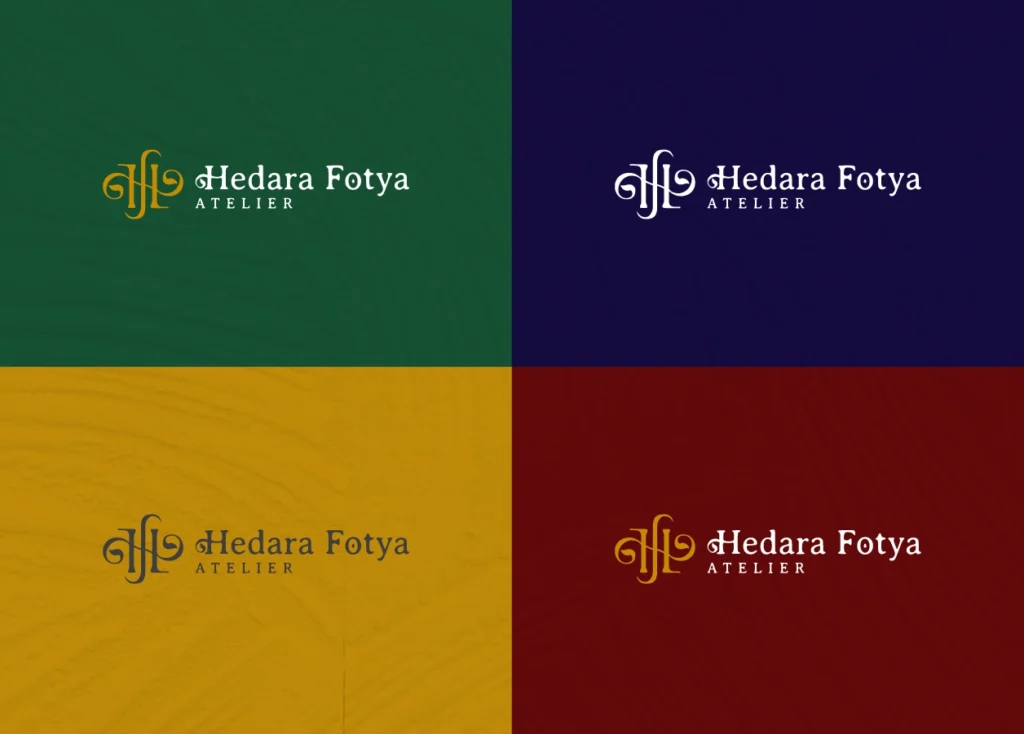
The colors for this branding are jewel tones, inspired by the different types of gemstones the client uses. The main colors are blue and yellow, supported by red and green, all combined with paint and velvety textures, to make it look like this natural and elegant.
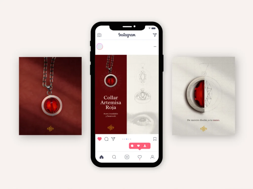
For the social media content, we wanted to show the clients the inspiration of each piece. We scanned the sketches and created a post comparing the final piece with the original drawings, as well as adding the different inspirations for the jewels.